I turn
ambiguity
into flow—
at scale.

Meta WhatsApp Walmart
Emma Gu
Meta Creatives
Meta

Marketing Messages Creatives

View work
Meta Conversations
Meta

Marketing Messages Conversations

View work
Walmart Seller Center
Walmart

Seller Center
Homepage

View work

About

A product designer based in the Bay Area (San Jose).

Most recently I was at Meta, leading the Marketing message experience team — building 0→1 AI-powered creative tools and working closely with PMs, engineers, and data scientists along the way.

Before that, I was at Walmart Marketplace leading the seller acquisition and communications team — designing the Seller Center homepage, onboarding, notifications, and the overall seller experience.

Earlier in my career I did a completely different kind of design — experiential and brand work. Different medium, same job: I've always been a designer.

Emma Gu
01 — Meta · Ads Manager

Creatives

Creatives
+42.67%
CTR — multi-text vs single text
Marketing messages with multiple text variants performed 42.67% better in CTR than those with a single text option.
95%
MM delivery rate — end of project
Structural IA change meant primary text auto-powered MM — lifting delivery rate from near-zero to 95%.

Marketing messages inside Meta Ads Manager

Marketing messages (MM) are a message-based ad format for messaging opted-in customers on WhatsApp, Instagram, or Messenger. This project focused on WhatsApp.

I led design on how MM fits into the creative flow and how to bring ads-level text optimization on top of it, working closely with the Ads team throughout since they own the broader Creative space.

Role
Lead Designer · Project Owner
Team
PM · Engineering · Data Science · Content Designer
Collaboration
Ads team alignment throughout

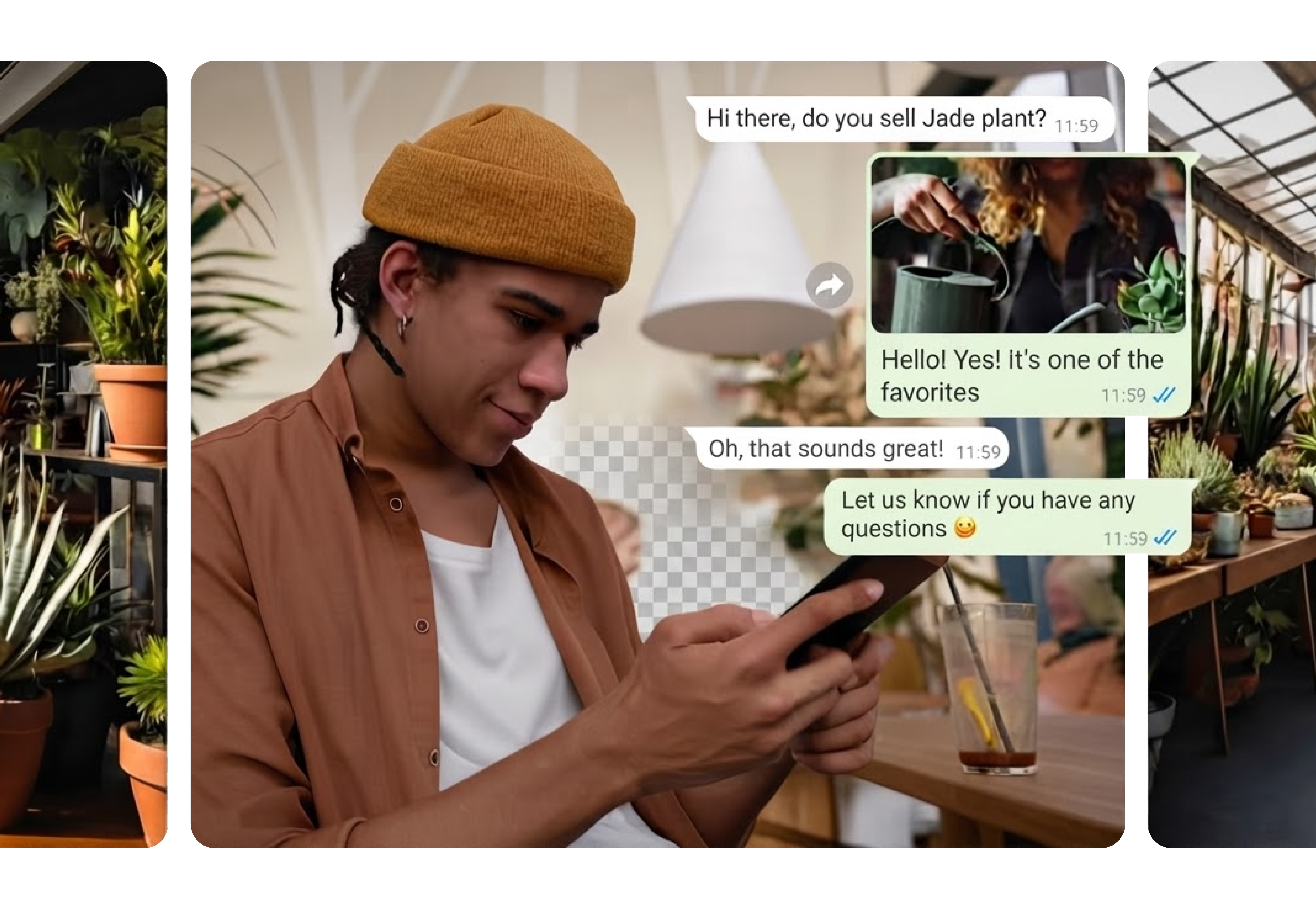
A WhatsApp MM is a promotional message delivered straight to an opted-in customer's inbox, not a feed. Unlike standard ads, a reply opens a real conversation.

MM can be sent through multiple channels. One is Meta Ads Manager, where it runs as a placement alongside existing ads — letting businesses reach opted-in WhatsApp customers with their existing ad spend.

New product launches Promotions & deals Re-engagement
Marketing message example
Media
Tap Target
Headline
Primary Text
Call to Action
Quick Replies

Restructuring the IA — and building on top

MM setup was buried in a separate modal most advertisers never reached, and since it wasn't required, they skipped it — so MM often wasn't sent at all. The fix was structural: I moved it into the Creative flow itself, with its own field pre-filled from the ad text so it's never blank but still clearly distinct. That alone lifted delivery rate from near-zero to 95%.

Original creative setup
Ad creative setup — MM buried at the bottom
MM setup modal
Clicking "Edit marketing message" opened a separate modal
Before
Name · Identity · Setup
Destination
Creative
Ad setup
Media
Text
Enhancement
Marketing message setup
Suggested optimizations
Text
Auto reply
Advanced features
Quick replies
Advantage+ · Language · Tracking
After
Name · Identity · Setup
Destination
Creative
Ad + Marketing message setup
Media · Enhancement
Text
Ad text
Marketing message text
Advantage+ creative
Conversations new
Auto reply
Quick replies
Language · Tracking
Text setup

MM was zero-to-one for most advertisers, so giving it its own field made it legible as distinct from ad copy — pre-filled from the ad text so it's never blank.

Gen AI

We added Gen AI text generation natively in the creative wizard, surfacing performance-optimized alternatives advertisers can accept or refine without leaving Ads Manager.

Multi-text options — bringing ads-level optimization to MM

MM was being sent, but CTR was low, and only 1.4% of advertisers customized the message text. Multi-text variants were already proving their value on the ads side — a +16.33% CTR lift — so the opportunity was clear: bring that same lift to MM.

Ad text multi-text options
23%
of ads adopted
multi-text options
1.4%
of MM texts
were customized
"Due to low adoption, we planned to leverage the multi-text options already added by advertisers for ads — and extend them to MM."

Phase 1 showed MM was buried at the bottom of the ad creative flow. Phase 2 opened a new path: since advertisers were already writing multiple ad text variants, we could extend those to MM automatically, without adding yet another input to an already complex workflow.

Step 1 · Design Exploration

I explored three directions before deciding how to move forward:

Direction 1 — Unified ad & MM text
Direction 2 — Conditional MM customization ✦ Chosen

I recommended Direction 2 as the MVP — always visible without adding UI complexity, and the lowest engineering lift.

Step 2 · A/B Test

With Direction 2 chosen, the open question was how visible to make the customization option, so I ran an A/B test.

Option A — Progressive disclosure

Shows options only when needed; ads copy is used for MM by default.

+Keeps the UI simple and focused
+Reduces visual noise and cognitive load
MM customization may be missed unless advertisers expand
Option B — Full visibility

Displays all options at once for immediate comparison.

+Greater visibility and prominence for MM
+Advertisers can compare options at a glance
+Fewer clicks to explore
UI may feel visually dense or cluttered
Higher cognitive load when multiple elements compete

We measured MM customization rate across a 10% then 50% rollout.

Option A — Dropdown
27.8%
customization rate at 50% rollout
Option B — Radio · Winner
32.4%
customization rate at 50% rollout

Full visibility made the option easier to find and act on — Option B won.

To push customization further, we redesigned Gen AI for MM — from one suggestion advertisers had to fully replace their text with, to up to 5 variants they can pick from at once.

Before
After
MM-specific best practices

We synthesized ~17,000 Marketing messages to find what drives high CTR in MM — tone and structure that work in direct messaging differ from standard ads. That informed Gen AI's suggestions: selective emoji use, personalization, under 550 characters, no sale-heavy language.

1
Default
Ads copy is used for MM by default
2
First option selected
MM automatically inherits all ad text variants for system testing
3
Customize selected
Gen AI surfaces up to 5 tailored variants to choose from

Multi-text drove significantly higher CTR for marketing messages

The more text options an advertiser adds, the more variants the system tests — surfacing whichever resonates most per consumer, and compounding the impact over time.

+42.67%
CTR lift for MM with multiple body text variants vs. single text

Unification — questioning the structure, not just the features

As the ads team began reworking the creative setup, I partnered with them early since MM and ads creative share the same space. That raised a bigger question: instead of two separate inputs, what if we unified them?

01
One unified field
Single primary text input for both ads and MM — one workflow, no duplication
02
Differentiated Gen AI
Same source, tailored output for ads vs. MM based on their separate best practices
03
Simpler interface
Less real estate, cleaner creation flow

This is what that unified experience could look like.

Sketch
Text
Add text
+ Add text option
Call to action
Learn more, Shop now…
AI routes to each placement
Advantage+ text generation ✦
Strategy 1
Ad text
Marketing message text
Strategy 2
Strategy 3
Cancel
Next
What's next

This became the north star for where MM and ads creative should converge next: a single input, with Gen AI tailoring suggestions for each surface behind the scenes.

02 — Meta · Ads Manager

Conversations


Turning marketing messages into conversations

Marketing messages don't end at publish. When a consumer replies on WhatsApp, a conversation begins — but that post-publish experience had no home in Ads Manager, buried inside the pre-publish creative setup flow.

I led the end-to-end design to give conversations their own surface, and defined the future direction for how AI could make those conversations scalable for advertisers.

Role
Lead Designer
Team
PM · Engineering · Content Designer · Data Science

A WhatsApp MM is a promotional message delivered straight to an opted-in customer's inbox, not a feed. Unlike standard ads, a reply opens a real conversation.

MM can be sent through multiple channels. One is Meta Ads Manager, where it runs as a placement alongside existing ads — letting businesses reach opted-in WhatsApp customers with their existing ad spend.

New product launches Promotions & deals Re-engagement
Marketing message example
Media
Tap Target
Headline
Primary Text
Call to Action
Quick Replies

Conversations drive MM performance — but they're not happening

Marketing messages are one-directional today. 60% of consumers read them, but only ~1% end up in a real conversation.

FINDING 01
60% read rate
Consumers see the message, but the drop-off happens after — there's no partner on the other side to continue it.
FINDING 02
3.26% → 19.31%
Only 3.26% of consumers reply. Of those, just 19.31% become deep conversations (2+ messages each side) — the rest drop off.
FINDING 03
+11% CTR
MMs with deep conversations show 11% higher CTR. When conversations happen, performance follows.

Of our MM advertisers, 61% manage replies directly with no third-party tool, and 89% of those have no conversation tool at all. Chat Builder wouldn't be an upgrade for them — it'd be their first ever reply management solution.

"The data showed a clear opportunity: if we could make conversations happen more reliably, CTR would follow. The product just didn't have the right surface to support that yet."

The automation setup was in the wrong place entirely

Auto Reply and Quick Replies were collapsed into Creative, a pre-publish flow with no connection to post-publish conversations — two different moments in the advertiser journey sharing one card.

"Most advertisers never found the automation setup at all."
Pre-publish · Creative

Where advertisers configure the marketing message before it goes live — a one-time setup before the campaign launches.

Post-publish · Conversations

Where automation lives — Auto Reply and Quick Replies only matter once a consumer replies. A response layer, independent of how the message was built.

1
Working session
With Business Messaging team's designer to formalize the pre vs. post framework
2
Leadership presentation
Brought the framework to both Ads and BM leadership
3
Cross-team alignment
Both sides approved the restructure — argument was structural, not subjective
Before
Name · Identity · Setup
Destination
Creative
Ad setup
Media
Text
Enhancement
Marketing message setup
Suggested optimizations
Text
Auto reply
Advanced features
Quick replies
Advantage+ · Language · Tracking
Recommended
Name · Identity · Setup
Destination
Creative
Ad setup
Media
Text
Enhancement
Conversations new
Auto reply
Quick replies
Advantage+ · Language · Tracking

Chat Builder — a new home for conversations

Auto Reply and Quick Replies moved out of Creative into their own dedicated card — Chat Builder — at the same level as Creative in the L1 flow.

We didn't start from scratch: Click to WhatsApp (CTWA) already had a Chat Builder, and most MM advertisers are also CTWA users, so we built on the same pattern for one consistent setup surface.

"We didn't introduce something new. The mental model transferred directly."
Chat Builder — where it lives in the L1 flow
Template Management

Apply a full automation setup in one click from a saved configuration — Chat Builder auto-saves your setup every time you publish.

Automation Preview

See what's configured before you publish — both automations shown inline.

Quick Replies

Quick reply buttons delivered with the MM — when a consumer taps one, that response is sent instantly.

Auto Reply

Triggered automatically when a consumer sends any message. Pre-filled by default so advertisers can publish immediately without any setup.

Before

No live preview. Advertisers published without seeing the consumer experience.

After
Interactive live preview

Right panel updates in real time as advertisers configure.

Consumer POV

Preview shows exactly what the consumer will see and receive.

Improved grouping

Replaced nested fields with flat layout — button and response relationship is clearer.

Placeholder association

Updated placeholder text to better match the quick reply configuration component.

"Advertiser feedback confirmed that setup was significantly easier — many could configure their automations immediately, without any guidance."

Automating the conversation gap at scale

Business AI closes that gap by turning every marketing message into an intelligent two-way conversation. AI responds instantly within the 24-hour free messaging window, so advertisers pay nothing extra to reopen conversations.

Existing MM advertisers complete a one-time BizAI onboarding, then the feature surfaces directly inside the Conversations card and Chat Builder — no new surface to learn.

The opportunity
Every unanswered reply is a missed conversion. Business AI turns that gap into a scalable conversation engine.
24-hour free window
A consumer reply opens a free 24-hour window. Business AI responds instantly within it, at no extra cost.
One-time onboarding
Existing MM advertisers complete BizAI setup once — then it surfaces at L1 inside Conversations card and Chat Builder.
Strategy exploration · Not launched

I also redesigned the quick reply placement, moving the buttons below the CTA to visually separate the marketing message from the conversation entry point — the hypothesis being that a clearer distinction drives higher conversation initiation.

"Without automation, every consumer reply goes nowhere. Business AI closes that loop."
03 — Walmart Seller Center

Seller Center

↑ 1200 bps
Landing Page NPS
Improvement in NPS score after launch
1600
Homepage Card CTR
Average clicks per day across homepage cards
↑ 82%
Promotion Adoption
Increase in WMP Capital Program adoption

The platform powering Walmart's third-party sellers

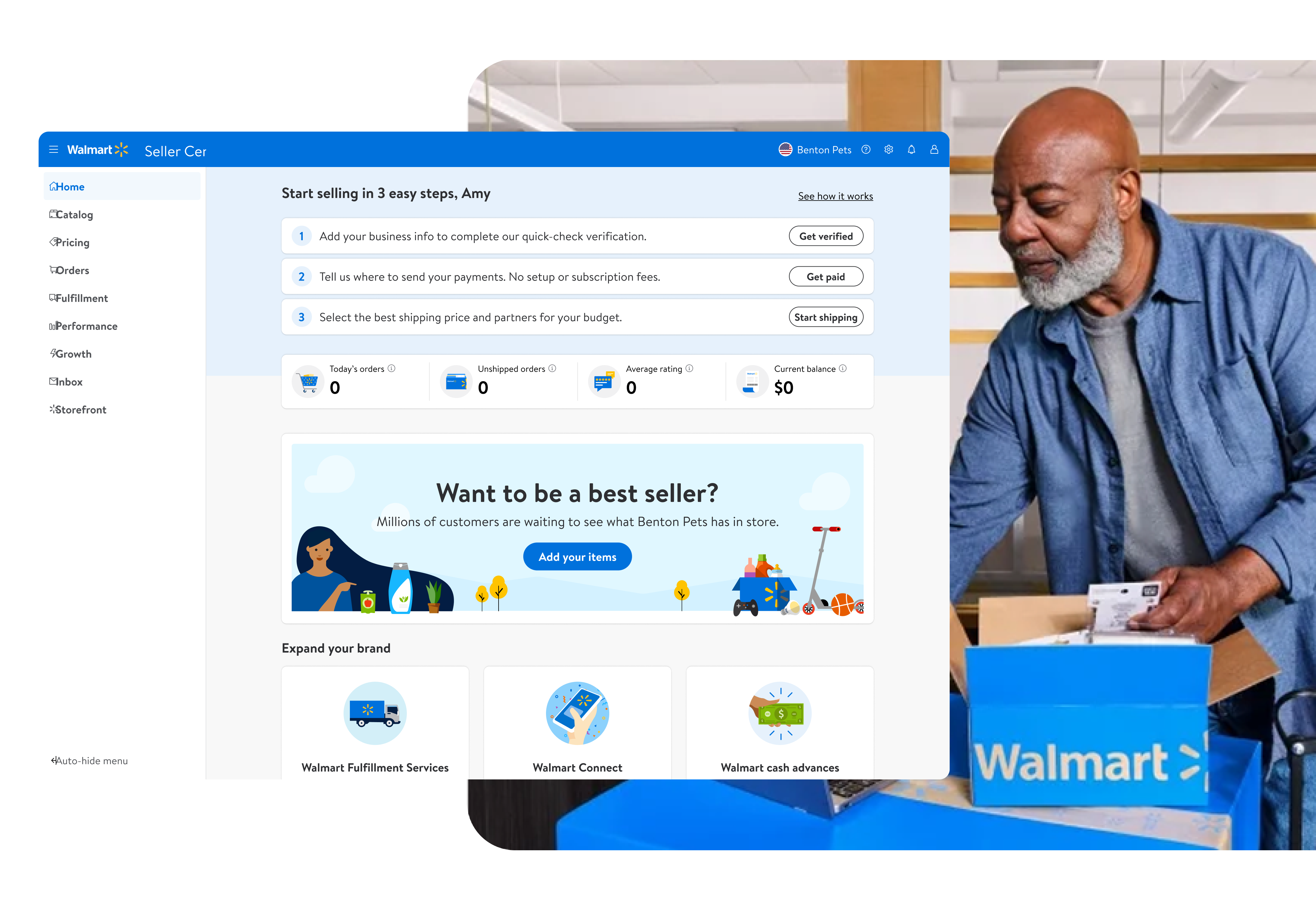
Walmart Seller Center had no dedicated homepage — sellers landed directly on the items page with no sense of context, priority, or what to do next. I led the end-to-end design of the first-ever homepage from scratch, from competitive analysis through to launch and design QA.

Role
Lead Designer · Project Owner
Team
PM · Engineering · Content Designer

There was no homepage — sellers had nowhere to start

Without a dedicated landing page, sellers went straight to the items page. Unrelated notifications appeared on this page to alert sellers, with no sense of priority or context. There was no homepage that could help sellers understand their business, complete tasks, or grow their store.

Before
"The website is lacking in general functionality related to the tasks needed each day."
"A lot of tasks are too manual to remember."
"We would like to have more complete information in one place."
"I hope there is a dashboard to tell new orders, return and refund requests — just an overview of my account."

Every major competitor was ahead

I audited Amazon, eBay, Etsy, and Shopify to understand what sellers experience elsewhere. All four had dedicated homepages with task guidance and growth features. Walmart had none of these — and was the only platform without a dismissible notification system or a promotions discovery surface.

Platform Guided tasks Contextual metrics Growth tips Lifecycle-aware

Defining what belongs on the homepage

I ran a content workshop with the product team to determine the essential requirements across three core areas: key business metrics, tasks, and growth. From there, we mapped each piece of content to the seller's lifecycle stage — whether they're onboarding for the first time or already an active seller — so the homepage surfaces the right information at the right moment.


Three pillars. One homepage.

A clear mission emerged from the research: the homepage should help sellers run their business, complete their tasks, and grow their store — in that order of urgency.

01
Run the Business
Surface the metrics that matter — revenue, orders, conversion — with context for trend, not just the number.
02
Complete Tasks
Prioritize pending actions by business impact. Turn the homepage into a daily triage layer.
03
Grow the Store
Offer contextual growth tips — promotions, listing health, programs — relevant to where sellers are in their lifecycle.

Mapping needs by lifecycle stage

A week-one seller and a three-year veteran need completely different things. I mapped the full journey to design an experience that adapts to where sellers are.


Exploring the layout

I explored several directions before converging on the final approach — testing how to balance metrics density with task clarity.

Initial homepage with three core sections

After several iterations, we developed the initial version of the homepage — a single layout organizing everything sellers need into three focused sections: To-dos, KPIs, and Promotions.

Testing comprehension — new design vs. original onboarding

We tested this first-round design using the PURE (Practical Usability Rating by Experts) method with 5 evaluators. To set a baseline, we first tested the original onboarding flow, then integrated that onboarding into the new homepage to see how the To-do section improved seller comprehension.

Original onboarding flow

The original onboarding prioritized the "Add Items" banner over the actual setup steps — sellers were pushed toward listing products before completing essential account setup, causing confusion and drop-off.

New onboarding flow

By integrating onboarding into the To-do section, sellers could clearly see what setup steps remained — in the right order, with the right priority — without being distracted by promotions.

New design outperformed across every task

5 Evaluators
  • 2 Designers
  • 2 Products
  • 1 Researcher
User Mindset
  • Prospective Walmart Marketplace seller
  • Already sells on Amazon and eBay
Original onboarding 17
Become a Verified Seller 4
Add Payments 5
Review Status 3
Add Shipping Information 5
New onboarding 11
Become a Verified Seller 4
Add Payments 3
Review Status 2
Add Shipping Information 2
PURE score — lower is better. Teal = easy, yellow = moderate, red = difficult.

A homepage that knows who you are

The redesigned homepage brings together three focused sections in one scannable layout — adapting to each seller's stage and surfacing the right information at the right time.

TO-DOS
Action-first
Sellers can clearly see what needs to be done — ordered by urgency and business impact, so nothing falls through the cracks.
BUSINESS KPIs
Performance at a glance
Key metrics like revenue, orders, and conversion shown in context — with trend signals so sellers understand their business without digging.
PROMOTIONS
Contextual growth
Relevant programs and promotions surfaced based on where the seller is in their lifecycle — not one-size-fits-all banners.

A framework for what shows up and when

In collaboration with the Content Designer, we developed a framework to determine what content belongs on the homepage and where — including where seller alerts should be routed, how each module is prioritized, and when content appears or retires based on the seller's lifecycle stage.

Banner lifecycle

Promotional banners were a major pain point — they'd pile up, go stale, and drown out more important tasks. I designed a lifecycle system that controls how banners appear, surface, and expire.

What sellers said

"I LOVE the homepage you've created."
"Love the new homepage, I can even see new orders everyday!"
"It's really easy to work with."
"This is new and interesting. It's a good landing page."
"If we can have a checklist of the actions needed to keep the site at top shape, that will help."

Measurable impact across the board

↑ 1200 bps
Landing Page NPS
Improvement in NPS score
1600 /day
Homepage Card CTR
Average clicks per day across homepage cards
↑ 82%
Promo Adoption Rate
Increase in WMP Capital Program adoption